⚠️ You are viewing documentation for an older version of Compose SDK.
Version:
# Function ThemeProvider
ThemeProvider(
props):ReactElement<any,any> |null
Theme provider, which allows you to adjust the look and feel of child components.
Components not wrapped in a theme provider use the current theme from the connected Fusion instance by default.
# Parameters
| Parameter | Type | Description |
|---|---|---|
props | ThemeProviderProps | Theme provider props |
# Returns
ReactElement< any, any > | null
A Theme Provider component
# Example
Example of a theme provider, which changes the colors and font of the nested indicator chart:
<ThemeProvider
  theme={{
    chart: {
      backgroundColor: '#333333',
      textColor: 'orange',
      secondaryTextColor: 'purple',
    },
    typography: {
      fontFamily: 'impact',
    },
  }}
>
  <IndicatorChart {...chartOptions} />
</ThemeProvider>
Indicator chart with custom theme settings:

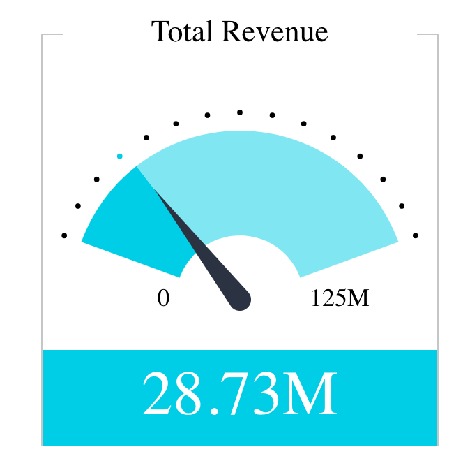
For comparison, indicator chart with default theme settings:
# See
ThemeSettings and IndicatorChart